Venmo
| AYAKA NONAKA
This week, we launched an update to Venmo for iOS, introducing a drawer-based navigation pattern. You can download it from the App Store here.
Recently, side-drawer designs have been going out of vogue. Most notably Facebook, who spent a lot of effort educating the broad user population about the side-drawer metaphor, moved to using a tab bar based design citing increased engagement.
We spent a lot of time (and user testing) investigating if the side-drawer was right design for Venmo for iOS. We landed on a solid 'yes'.
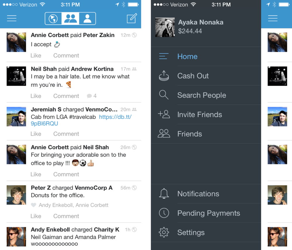
The discoverability of a user's own profile and account settings prior to this release was, well, not so great. In our user tests for the new design, the majority of testers immediately opened the drawer to explore what they could do. In addition to being extremely discoverable, the side drawer is completely unobtrusive to the key user flow of opening the app and making a payment. We talked a lot about how a major goal of our product design is to focus on simplicity and allow the content and main interactions to be front-and-center in our iOS 7 design post. We think that the side-drawer is a perfect realization of this design philosophy.
To be frank, we also thought quite a lot about why it didn't work for Facebook – nobody wants to make a mistake that someone else already made. Our conclusion is that Facebook has a much broader array of functionalities with dozens of important flows – events, groups, friends, requests, messages etc., whereas Venmo has only two primary actions: looking at the feed and making payments. The other actions, while still important, are much less frequently needed. (E.g. adding a new funding source, changing notification settings, etc.) We think that this very focused, restricted set of functionality is what makes the drawer work so well for us.
iOS 7 brought a new wave of design at Venmo and it has also reinforced the idea of using depth inside of your application to show hierarchy of views. The side-drawer (being modeled as underneath the primary view) now fits perfectly into iOS 7's modeling of depth and reinforces depth as an indicator of hierarchy.
We believe that this is faster, clearer way to use Venmo and pay your friends. Let us know what you think!